
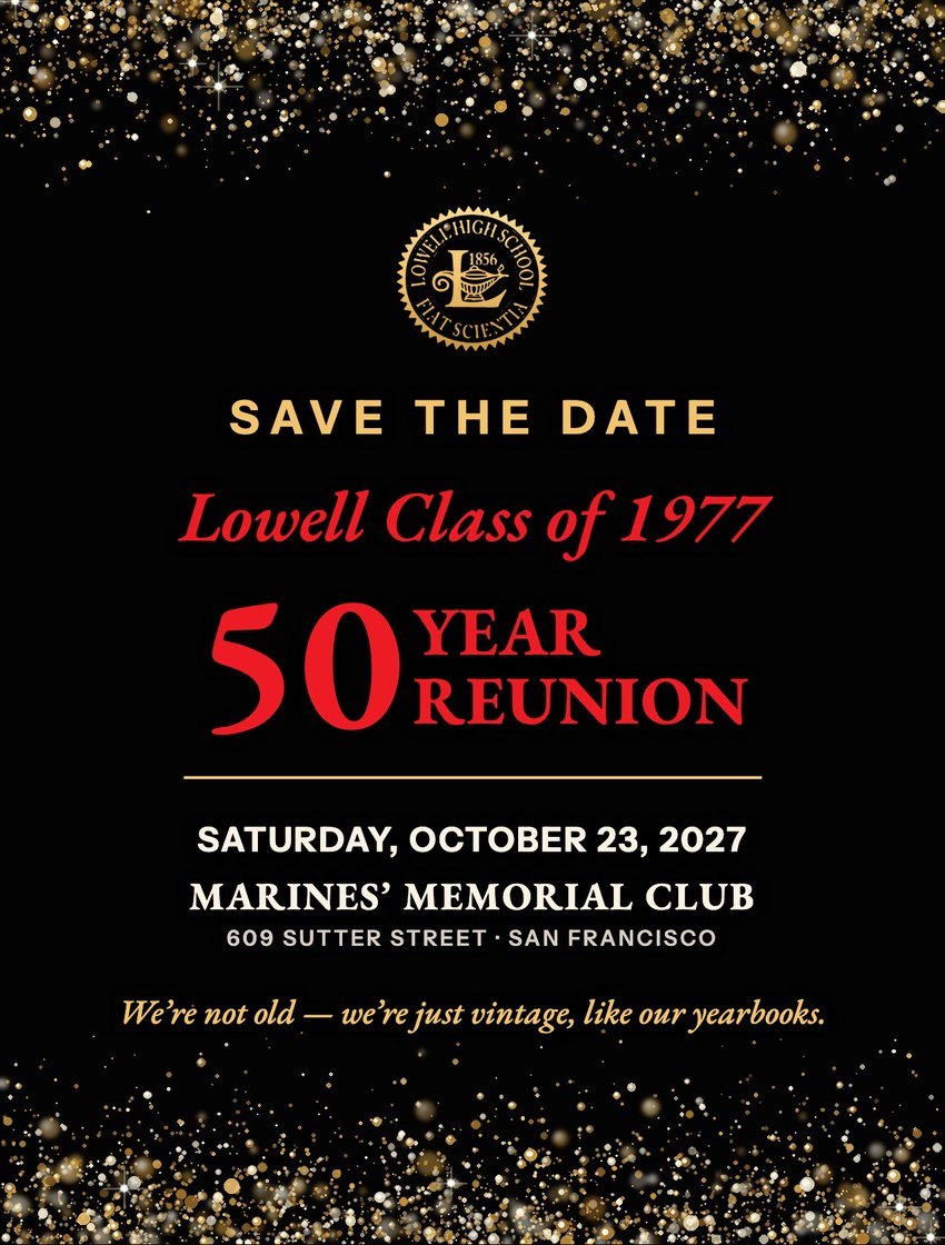
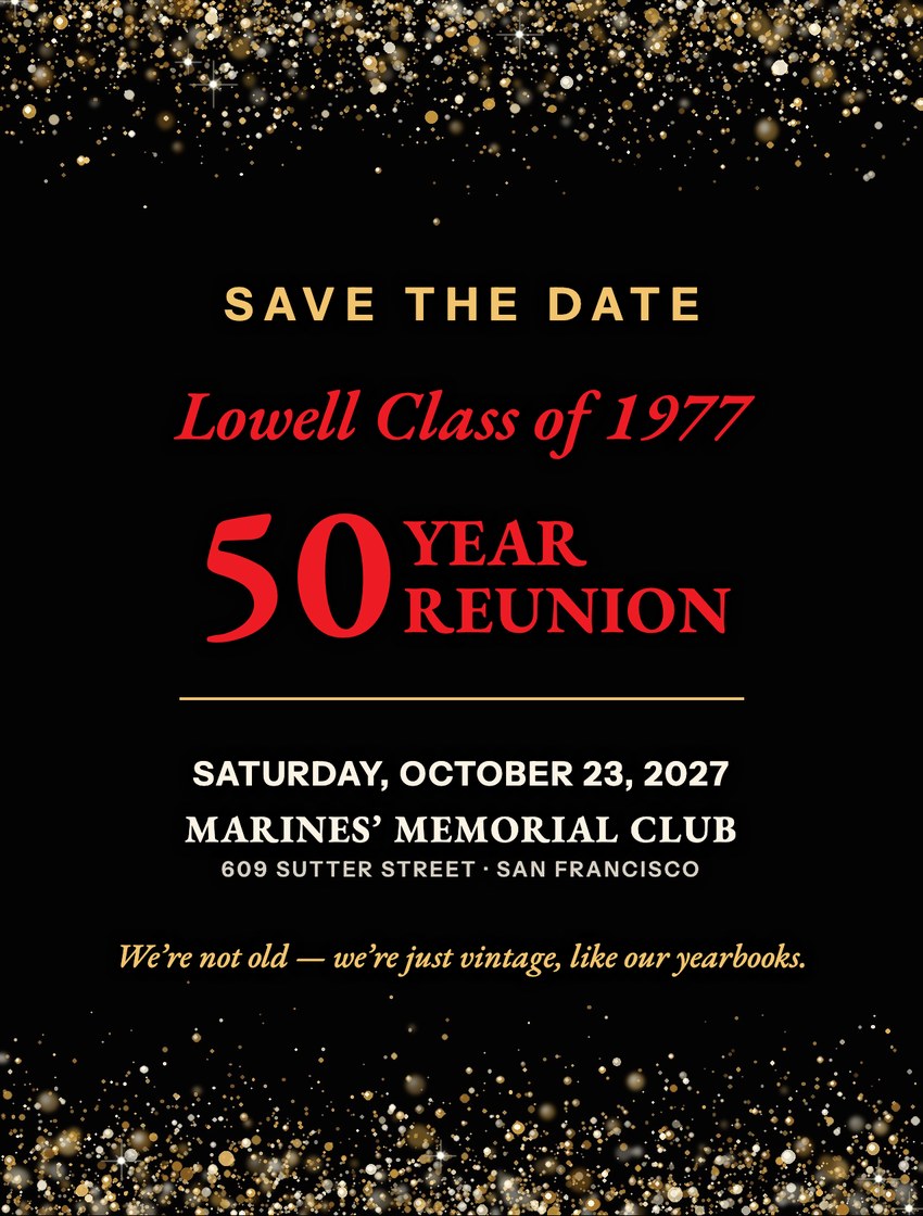
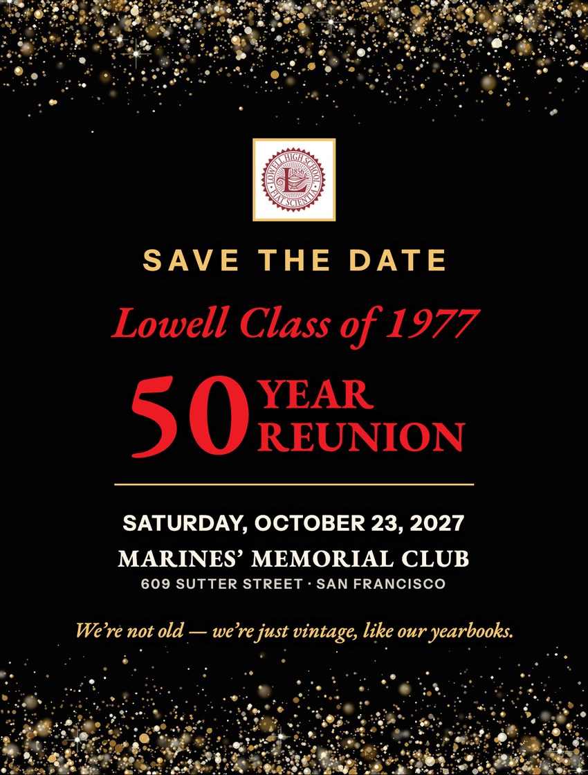
Three choices for the front of our 50 Year Reunion Save the Date postcard, all on black with gold sparkles and red lettering. They differ only in the Lowell seal at the top. The back is the same for all three. Cards are 4.25 × 5.6 inches. Click any picture to see it larger.
Front choices
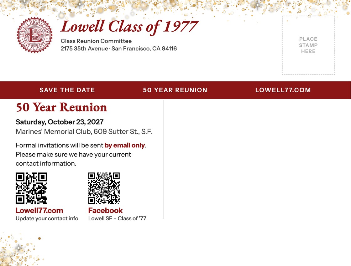
Back (address side)
Mailing guides on the back
The same back with guide marks showing where things go. The guides are only for planning and are not printed.
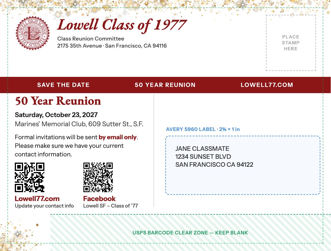
- Blue dashed box: where the Avery 5960 address label goes (2⅝ × 1 in). The sample address is fictional.
- Green striped strip: the USPS barcode clear zone, the bottom ⅝ inch, where the Post Office prints its sorting barcode. It must stay blank.
- Green dashed line: the safe area. Text stays inside it so nothing is trimmed off at the print shop.
- Stamp box: top right, where the stamp goes.
Why the back is white
- Labels blend in. The Avery 5960 address label (2⅝ × 1 in) is white, so on a white card it doesn’t look like a sticker on black.
- Postmarks show. The Post Office cancels stamps in black ink, which disappears on a black card.
- Barcode strip stays clear. USPS sprays a sorting barcode along the bottom ⅝ inch of the address side, so the sparkles stay at the top edge and one corner.
- Easier reading. The small print on the back is easiest to read as dark text on white.
Questions for the committee
- Which front: A gold seal, B no seal, or C color seal?
- Is the wording right? “Saturday,” “Marines’ Memorial Club” and 609 Sutter Street come from the website’s reunion banner.
- The QR codes open Lowell77.com and the class Facebook group. Should the website code go straight to a page for updating contact info?
- Which print shop, and does it need ⅛-inch bleed? Could it print the gold in metallic foil?
Download the PDFs
Each PDF has the front on page 1 and the back on page 2, at actual card size.

